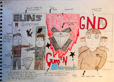
The ideas i wanted to achieve in designing my three draft posters is to use a pinnacle and iconic images from the film which i could use in my posters, i think this would appeal more to the audience as it will give them an inside to what happens it certain parts of the film. the middle poster the teaser poster i just wanted to keep simple so i decided to add the main elements to what are in the film. in the last poster i used the initials of the film, i think this would also make a good logo for the film. i wanted to use dark colors in the poster to represent the film being a dark thriller. i have used a lot of red in the posters to show the film will contain violence. In the first poster i wanted to make the 'guns' in a big, bold and metallic font, i think this gives the poster a more of an urban feeling and showing the audience where the film will be set.
No comments:
Post a Comment