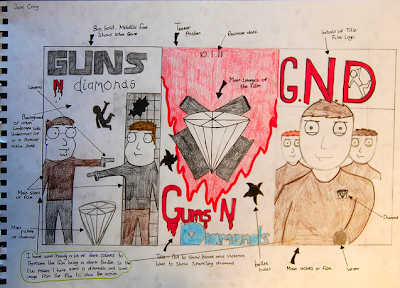
The ideas i wanted to achieve in designing my three draft posters is to use a pinnacle and iconic images from the film which i could use in my posters, i think this would appeal more to the audience as it will give them an inside to what happens it certain parts of the film. the middle poster the teaser poster i just wanted to keep simple so i decided to add the main elements to what are in the film. in the last poster i used the initials of the film, i think this would also make a good logo for the film. i wanted to use dark colors in the poster to represent the film being a dark thriller. i have used a lot of red in the posters to show the film will contain violence. In the first poster i wanted to make the 'guns' in a big, bold and metallic font, i think this gives the poster a more of an urban feeling and showing the audience where the film will be set.
Wednesday, 15 December 2010
Monday, 13 December 2010
Friday, 10 December 2010
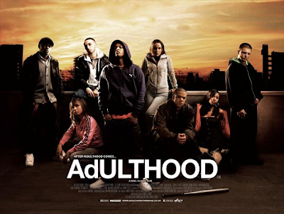
AdULTHOOD Film Poster
The Adulthood poster mainly consists of the main group of characters which are based on the film. The main group of characters looking as though they are on top of a building looking at the camera, the look of the characters faces and their posture may make the audience scared and threatened, also making look like they are dominating everything else.
The main design of the film poster is the use of dark colors to give the audience a dark imagining to the film. Also the poster shows a landscape background of London which tells the location of the films setting. There is also a weapon lying on the floor, this tells that there will be violence in the film.
The main colors for the people in the poster are dark, the background color of the buildings are dark, this could tell us that the locations are not very pleasant.
The title 'AdULTHOOD' gives me an image of this film being a next chapter from 'Kidulthood' as as the film progresses from the group of characters changing from teenagers into adults. Also what i also think about the title is that what happens in the film is just a phase that the characters go through that will pass.
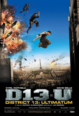
DISTRICT 13: ULTIMATUM Film Poster
In this movie poster, the people starring in the movie are jumping through mid air in front of a massive explosion, this image shows us that there is going to be lots of action in the film. The way they are represented in the poster is by a lot of action and parkour.
The design of the poster shows a backdrop of paris and in the foreground a big explosion from a building with the stars jumping from from one building to the other, this could be a pinnacle shot from the film so it creates a more of a dramatic effect for the audience.
The main color in the poster is the blue skyline, which takes up a good part of the poster. Then getting darker till it is black at the bottom.
The title's lay out is in a kind of shortened and abbreviated, it almost looks as though it could be a name for a gang, which also could give us a insight to what the film is about. Also the title takes up a large portion of the bottom part of the poster, the reason why i think they have made the title the biggest part of the poster is to make the audience see that first and it is very clear and easy to read. i think the title and font reflects on the type of film as it has a kind of concrete and urban background.
Thursday, 9 December 2010
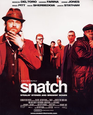
Snatch Film Poster
The snatch film poster has a very simple structure only consisting of the main characters who are in the film, and the title and the production credits. The stars are presented as eightys gangsters, the way this is presented is by their appearance. Brad Pitt is the leading man as he is the well known actor and he is the biggest in terms of film, then it is almost as though the audiences eyeline takes them to the next biggest actor who is vinnie jones, then leads on to the back where the characters Tommy and Turkish remain.
The background colour of the poster is white and plain. The reason i think why there is a plain background is to emphasise the characters which have a kind of red color, this could represent blood and give the audience an image of the film being violent.
The title 'Snatch' gives the audience the impression that the film sounds like a game as the diamond keeps getting taken and snatched from different gangs as they want it. The title is also cer easy and clear to read which may also attract more of an audience.
Tuesday, 7 December 2010
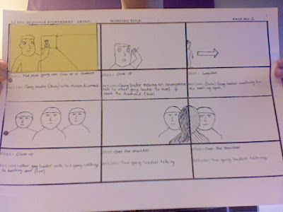
STORYBOARD ANALYSIS
In the storyboard, the scene starts with the gang leader that has stolen the diamond on the phone planning to meet up the other gang member where he is trying to get his diamond back. The two gangs meet up in a car park and fight it out to get the diamond back.
Meanwhile an undercover cop has been told that there is a stolen diamond and he has to go to the car park where the gangsters are fighting to retrieve it. He free runs from his location to the car park which includes parkour. By this time the gang leader who had stolen the diamond had managed to knock out the other ring leader, this is when the undercover cop comes in to the scene and then there is a chase scene with the cop and and the ring leader with the diamond. There is a fight between the cop and the ring leader to get the diamond, the undercover police man gets the diamond and then runs out of shot.
Wednesday, 1 December 2010
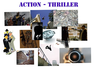
ACTION-THRILLER END SEQUENCE MOOD BOARD
what ideas i think have changed looking at my mood board would be the overall look of the gangsters. before the group and i decided on the gangsters dressed in a shirt and trousers but i think we should enhance it further to make the gangsters look more of a stereotypical gangster look. also what else we decided on is to film the sequence in daylight in a public area.
Thursday, 18 November 2010
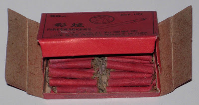
SPECIAL EFFECTS TERMS; SQUIBS
A squib is a miniature explosive device used in special effects. They resemble tiny sticks of dynamite, both in appearance and construction, although with considerably less explosive power. Squibs can be used for generating mechanical force, or to provide pyeotechnic effects for film productions. Squibs can be used for shattering or propelling a variety of materials.
SPECIAL EFFECTS TERMS; PROSTHETICS
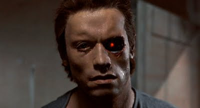
Prosthetics Artists work on feature films and in television on commercials, pop promos, corporate productions, light entertainment programmes, documentary dramas, etc. Prosthetics are appliances made of rubber, plastic, gelatine, silicone, or any other material that can be affixed to an Actor's face or body, in order to change their shape and/or appearance.
A film which uses lots of film prosthetics is Terminator
SPEACIAL EFFECTS TERMS; CGI
CGI stands for computer generated images, CGI is used for visual effects because computer generated effects are more controllable than other more physically based processes. it is used to make computer-generated imagery for movies, etc.
A film production that uses a lot of computer generated images is Pirates of the Carribean
SPECIAL EFFECTS TERMS; BULLET TIME
Bullet time is a special and visual effect that refers to slow motion photography used in films. It is characterized both by its extreme transformation of time, such as flying bullets and space by way of the ability of the camera angle the audience's point of view to move around the scene at a normal speed while events are slowed. The bullet time effect was originally achieved photographically by a set of still cameras surrounding the subject. These arrays are usually triggered at once or sequentially. Singular frames taken from each of the still cameras are then arranged and displayed consecutively to produce an orbiting viewpoint of an action frozen in time or as hyper slow motion.
An example of bullet time in a film production is The Matrix.
Wednesday, 10 November 2010
Tuesday, 9 November 2010
SPECIAL EFFECTS TERMS; ANIMATRONICS
Animatronics is the use of electronics and robotics in mechanised puppets to simulate life. For film productions, animatronics are used to perform action involving creatures that do not exist. Animatronics today is computor controlled and manual radio devises. Animatronics are mainly used in movie making, but also in theme parks and other forms of entertainment. Its main advantages to CGI and stop motion is that it is not a simulation of reality, but rather physical objects moving in real time in front of the camera. The technology behind animatronics has become more advanced and sophisticated over the years, making the puppets even more realistic and lifelike.
An example of animatronics in a film production wouls be Jurassic park.
BOMB sequence
section 1
the task was to film the final section from our bomb sequence, in the task an operator spoke to an telling him that a bomb has been located and for the agent to find and defuse it. Meanwhile the good operate gets killed and the original character 2 takes his place and on purpose tells the agent the wrong wire to cut making the college blow up. We had to shoot the task in three different sections, the phone call, the meeting then the final bomb sequence which we edited together at the end in final cut. Then we had to use green screen effects to blow up the school.
Section 2
in the filming process, we filmed 21 shots which we did not film in narrative order. I found confusing filming the outdoor shots first then filming the first shots in the narrative sequence last. The main contribution i made was being the first operator where i acted in 2 shots, i filmed most of the bomb sequence and i also took still pictures to add to the blog posts. In the editing process we used the clapperboards again to make it easier for us to edit. What i found to be most fun editing this sequence was we able to use effects to blow up the college, we used green screen effects where there was a variety of explosions and sound effects to choose from.
Tuesday, 2 November 2010
MEETING sequence
section 1
The task was to carry on the task from the phone call, we had to film a sequence of a meeting where character 2 met character 1 in an office (G19) where character 1 would tell character 2 where to place the bomb and hand the bomb over. In the storyboard process, we shot the sequence differently as we filmed them in order as apposed to filming the whole sequence in that location instead on moving on then going back to the previous location.
section 2
In the shooting process, we filmed the sequence in narrative order. The reason why other film productions do not film in order is it takes up much more time traveling from one location to the other. My main contribution to the meeting sequence was being an actor where i played character 1 in the sequence. I also took loads of still pictures during the whole production stages for evidence and to put on our blogs. In the editing process, we used clapperboards again to make it easier for to put the shots in the sequence and edit them. What i have learned from editing the sequence is making it look believable and make it look in real time. Also i have learned to make the shorts short and cut out any unnecessary bits to keep the audience interested.
Wednesday, 20 October 2010
The 180 Degree Rule
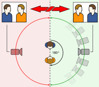
The 180 degree rule is very important concept in video and film production. It refers to an imaginary line which cuts through the middle of the scene from side to side with respect to the camera. Crossing the line changes the viewers perspective, it may cause disorientation and confusion.
Match On Action
Match on action is when you cut during an action to another camera angle shot but showing the action from the same point in time that you left it from the previous shot. this is important to continue the flow of the scene.
Monday, 18 October 2010
PHONECALL sequence
section 1 the task and planning
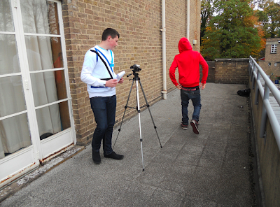
The task was to film a conversation between two characters in three different locations, the phone call is about character 2 delivering a bomb to character 1. Our group got eighteen shots that we had to shoot in order. After we had shot the sequence, we had to edit it in final cut where we had to rearange into a certain order to the sequence to make it look belivable and in real time. In the storyboard process, the shot lists we filmed character 1 in location 1 (shots 1-9) then we moved to location 2 and filmed characters 2s sequence (shots 9-16) then we filmed shots 17 and 18 in the corridor. The reason we stayed in the same place for the of the characters shots is because it saves time instead on filming one part then moving onto a new location then going back to the same location to finish the sequence.
section 2 filming and editing
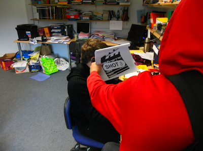
In the shooting process, the reason we did not film the shots in the narrative sequence was because it would be easier to film all of the shots in that certain location in one go rather than moving to a different location then moving back to the previous location. My main contribution to the phone call sequence was was being an actor where i played character 1 in the sequence. I also took loads of still pictures during the whole production stages for evidence and to put on our blogs. in the editing process, using the clapperboards helped me very much with ordering my shots because i could just drag the shots down in oreder then take out the capperboards, i thought it was much quicker as i would of had to watch each shot and then name them if we did not use the clapperboards. The rough cut is when you have the whole sequence in order without editing it. cutting on movement is when you go to the next shot but it is going straight into the action E.G. taking the phone out of a pocket, the reason we use this is becuase it keeps the audience intrested in the sequence and it can also build up the tension and make it more dramatic. during the editing process, what i have learned to do is make the phone call sequence look belivable and make it look in real time. Also i have learned how to keep the audience intrested and focused on my sequnce by using cutting on movements.
L2 LEE - PHONE CALL (GROUP 3) from cmdiploma on Vimeo.
Sunday, 17 October 2010
write up session - James Ward
On friday the 15th october, James Ward came into college from the National film school of Ireland. At the film school, James took a model making and production design for film and TV coarse, he finished last year. At the college, James demonstrated making a mask on a pupil. To make the mask, James started off by gluing a bald cap on the pupils head to cover the hair, he made sure all the pupils hair was in the bald cap. After he had glued the bald cap on, James mixed up a rubbery silicone which he applied to the pupils face. throughout the demonstration, James always wore polyvinle gloves, the reason for that is if he didnt use gloves it would ruin the silicone mix which would ruin the mask. James put straws in the pupils nostrils to ensure the pupil could breathe throughout covering his face with the silicone. James covered the pupils face in the blue silicone, he started off by covering his eyes, he pushed in the silicone quiet hard round his eyes to make sure the silicone would pick up the detail, then he put a thick layer around the rest of his face. After he put the silicone on the pupils face, he had to apply bandages to the pupils face which would harden and become much stronger. Before he put the bandages on, he put them in water then put them on the silicone. He started putting the bandages on from the outside of the face working his way in. James Always kept space around the pupils nostrils for beathing. He applied the bandages in criss cross patterns to provide more strength to the mask and less brittle. After he covered thr face, he smothed the bandages down with water, the mask was about half and inch thick after it had dried. Then James pulled the mask off the pupils head, there we could see the eyes, nose and mouth, he sealed the nostrils in order to pore in the plaster, then he covered up the nostrills with the bandages. James then made a plaster in which he would pore into the mask. The plaster was called Crystal Cal, he used this plaster as it was much tougher than other plasters, he started off with a slush coat which picked up all the details in the mask. James poured in the plaster gently to avoid air bubbles and lumps which could ruin the mask.
In the next session on 21st, James completed the mask, he let the plaster dry so he could add the features.
Tuesday, 12 October 2010
Scarface, Target Audience Member
My target audience member likes money and buying the most expensive of everything. He enjoys watching normal television programs on TV. He is particularly interested in playing crime and gangster games which involve violence and swearing, just like my chosen film. My person is a keen formula one fan and likes to see all the races as he can travel to hot and luxurious places. He is also into designer clothing brands and likes to wear smart clothes. He enjoys reading the sun newspaper as he is not into politics and Parliament, but into celebrity gossip and a more informal read. He also enjoys reading film magazines as he likes to watch the read reviews, see pictures and read about the film. For a night out, my character would go to more fancy restaurant compared to KFC or McDonald's, such as Pizza Express.
Thursday, 7 October 2010
Find Your Tribe
www.findyourtribe.co.uk
created by C4 by research agencies crowd DNA and voodoo.
this site invites you to complete an interactive quiz which asks you questions about you tastes on music, fashion, lifestyle, brands, media presences
At the end defining which youth tribe you belong to.
After i had taken the Find Your Tribe quiz, the tribe i belong to is a DIYer. I don't think this is my tribe that's suits me best, as a DIYer is represented and suited to people who are all about setting up a music career and hates Facebook and PCs. Although i do love Macs i don't think i am a DIYer. My results also show that i am showing signs of being a trackie. i also think that's an inaccurate representation of me as i like to wear new clothes and i care about the way i look.
class results:
Clubbers 1
Townies 2
Rahs 1
Chavs 1
Sports Junkie 1
Blingers 1
DIYers 1
Indie Kids 1
Skaters 1
Scene Kids 1
Saturday, 25 September 2010
Logo
L2 JACK - IDENT from cmdiploma on Vimeo.
My initial idea for my logo was to have a UFO which i could use to in Final cut to make it move. In Photoshop i found it difficult to make the logo as i am not familiar with the program, i was surprised how hard it was to come up with an idea that would be easy enough to create into a moving image, i was also surprised on hard i found using Photoshop.I was pleased with my design i created as it was easy enough to create and it looked good, i was also pleased with how i can use the tools in Photoshop to make the logo my own, and add effects.
Designing my logo was much harder than i thought and tuned out a big problem for me. i was not pleased with the progress i made as i did not manage to use my logo in Final cut. The way i resolved my problems was, i had to copy an image from the Internet and make it my own by using tools and image effects and use simple shapes to add to the image. at the end of the session i was able to complete the design on photoshop but i have not been able to move it to Final cut.
Wednesday, 22 September 2010
Advertising, Television Adverts
- A television advert is a span of television programming produced and paid for by an organization.
- The purpose of a television advert is to persuade or inform viewers about new products.
- The target audience for television adverts would be people who watch television and people who are intrested in the products advertised.
- Distrubution for television adverts are world wide.
Print, The Sun Newspaper
- The Sun is a daily tabloid newspaper
- its circulation is 3,009,987 copies a day.
- the suns distrubution is the Uk and Ireland.
- its purpose is to give readers the latest news and read celebrity gossip.
Electronic Media, iPad
http://www.apple.com/
- The iPad is a tablet computer designed and developed by Apple. It is particularly marketed as a platform for audio and visual media such as books, periodicals, movies, music, and games, as well as web content.
- the distrubution for the iPad is global.
- the target audience would be people who are into new technology and apple fans.
- the purpose of the ipad is to make it easy for people to access the internet, recieve and send emails, view photos and listen to music.
Audio/Visual, Family Guy
- Family Guy is an American animated television series created by Seth MacFarlane The series is based on the Griffins, the family consisting of parents Peter and Lois; their children Meg, Chris, and Stewie; and their talking dog Brian.
- the target audience for Family guy would be teenagers and people who are into animation comedys.
- the distrubution of the show is global hit.
- the purpose of the show is to entertain the viewers.
Audio, Radio One
http://www.bbc.co.uk/radio1/
- the target audience for radio one would be people who travel, and who like listening to the music and the DJs.
- the purpose of the radio station is to entertain the audience by having informal interviews with celebrities and show the latest music.
- Radio 1 is a British national radio station operated by the British Broadcasting Corporation which also broadcasts internationally, specialising in current popular music and chart hits throughout the day.
- the station is distributed throughout the UK and also America.
Subscribe to:
Posts (Atom)